Back to Work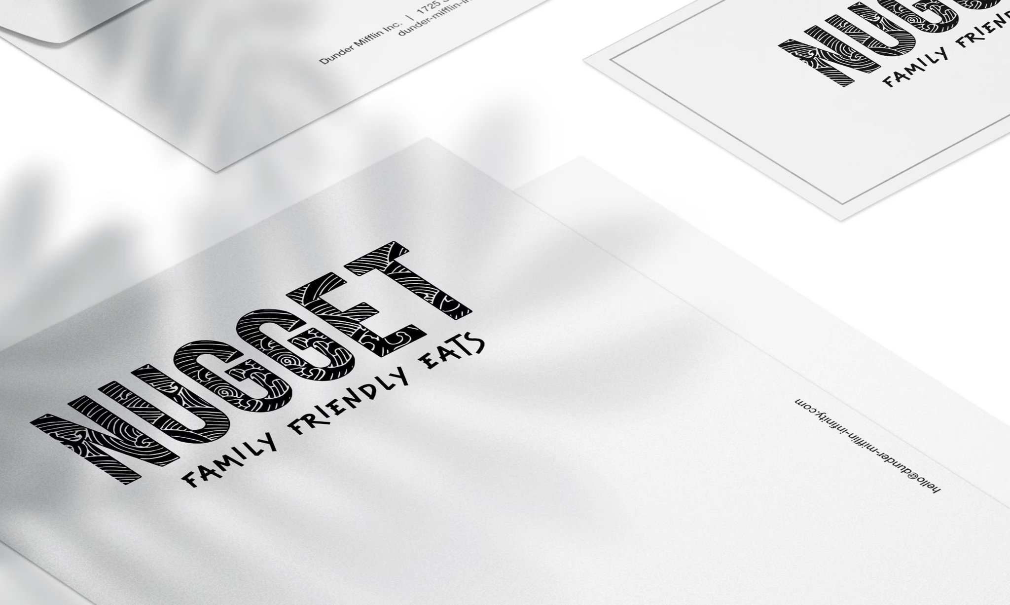
Nugget Brand Identity
Case study
Client
Nugget
Services
Brand Strategy
Visual Identity
Brand Guidelines
Design System
Industries
Parent tech
Consumer Brand
Food & Dining
Date
June 2024
Overview
Nugget needed a brand identity that could bridge two distinct audiences: parents seeking stress-free dining experiences and restaurants wanting to attract family traffic. The challenge was creating a visual system that felt warm and approachable without appearing childish or unprofessional.
The brand needed to communicate trust, simplicity, and joy—positioning Nugget as the reliable companion for family dining adventures rather than just another review app.
The Challenge
How do you create a brand that appeals to time-poor parents while maintaining credibility with restaurant partners?
Key tensions to resolve:
- Playful but not childish
- Fun but trustworthy
- Simple but comprehensive
- Family-focused but professionally credible
- Approachable for parents, respectable for restaurants
Brand Strategy
The Nugget brand needed to embody four core principles:
- Delicious: Making dining out feel exciting and appetizing
- Family: Celebrating the reality of eating out with kids
- Curious: Encouraging discovery of new places
- Fun: Bringing joy back to family dining
These values informed every visual and verbal choice—from color palette to iconography to tone of voice.
Visual Identity
The Nugget logo combines a friendly wordmark with a custom icon that suggests both food and community. The rounded letterforms feel warm and accessible, while maintaining enough structure to feel credible and professional.
Logo Design
The icon incorporates subtle references to both a chicken nugget (the universal kid-friendly food) and a map pin (discovery and location), creating a memorable mark that works across all touchpoints.
Color Palette
We developed a warm, appetizing color system that stands out in the crowded food app space:
- Primary: Warm orange-gold (evoking comfort food and sunshine)
- Secondary: Deep navy (credibility and trust)
- Accent: Fresh cream (cleanliness and simplicity)
- Supporting: Sage green, soft coral (natural and inviting)
The palette avoids the typical red-yellow fast food associations and the sterile blue-grays of tech platforms, instead creating a unique middle ground that feels both premium and approachable.
Typography
Selected a dual-font system that balances personality with legibility:
Font choices:
- Display: Rounded sans-serif for headlines and branding moments
- Body: Clean geometric sans for interface and information
- Weight range: 400 (regular) to 700 (bold) for clear hierarchy
Typography scales beautifully from mobile app interfaces to marketing materials while maintaining the warm, friendly brand feel.
Iconography System
Created a custom icon set featuring:
- Rounded corners and friendly geometry
- Consistent 2px stroke weight
- Practical symbols: high chair, pram access, changing table, kids menu
- Food and dining icons: cutlery, coffee, meal types
- Playful touches without sacrificing clarity
"Icons needed to communicate practical information quickly while reinforcing the brand personality"
Brand Voice
Developed tone-of-voice guidelines that balance helpfulness with personality:
Voice characteristics:
- Optimistic but realistic (acknowledging parenting challenges)
- Clear and practical (no jargon or cutesy language)
- Encouraging without being pushy
- Honest about trade-offs (not every place is perfect)
- Conversational but not overly casual
Top User Insights:
"Great for toddlers who need space to move"
"Quick service - perfect when you're in a rush"
"Cozy spot with generous high chair supply"
Brand Applications
The brand system translates seamlessly into the app interface:
Mobile App
- Warm color palette creates an inviting first impression
- Custom icons provide instant visual scanning
- Rounded corners and generous spacing feel relaxed
- Clear hierarchy guides users through discovery
- Photography style emphasizes real families in real restaurants
Marketing & Communications
Brand guidelines extend across all touchpoints:
- Social media templates with consistent visual style
- Email designs that feel personal not promotional
- Restaurant partnership materials that feel professional
- Community posters for cafe notice boards
- Press kit and brand story documents
Photography Direction
Established visual guidelines for photography:
Photo style principles:
- Natural lighting and authentic moments
- Real families (not stock photo perfection)
- Focus on experience not just food
- Warm tones and inviting compositions
- Show the space, amenities, and atmosphere
- Avoid overly staged or polished imagery
Design System
Created comprehensive brand guidelines including:
- Logo usage and clear space requirements
- Color specifications (hex, RGB, CMYK)
- Typography hierarchy and sizing
- Icon library and usage rules
- Component patterns for UI consistency
- Photography and illustration guidelines
- Tone of voice examples and messaging frameworks
- Do's and don'ts for brand applications
Restaurant Partner Materials
Designed assets to help restaurants understand and display their Nugget presence:
- Window decals: "Family-friendly & Nugget approved"
- Table cards explaining the Nugget Score
- Digital badges for restaurant websites and social media
- Partnership certificates recognizing family-friendly excellence
- QR codes linking to their Nugget profile
These materials needed to feel like a badge of honor for restaurants while maintaining the playful Nugget personality.
Outcome
The brand identity successfully positions Nugget as the trusted guide for family dining:
- Distinct visual presence in a crowded market
- Appeals to parents without alienating restaurant partners
- Flexible system that scales from app interface to marketing
- Memorable brand personality that encourages word-of-mouth
- Professional credibility supporting business development
Key Learnings
- Dual-audience brands require careful balance in tone and style
- Warmth and professionalism aren't mutually exclusive
- Icon systems are crucial for information-dense apps
- Brand personality should solve user problems, not just look nice
- Consistency across touchpoints builds trust faster than clever creativity