Back to Work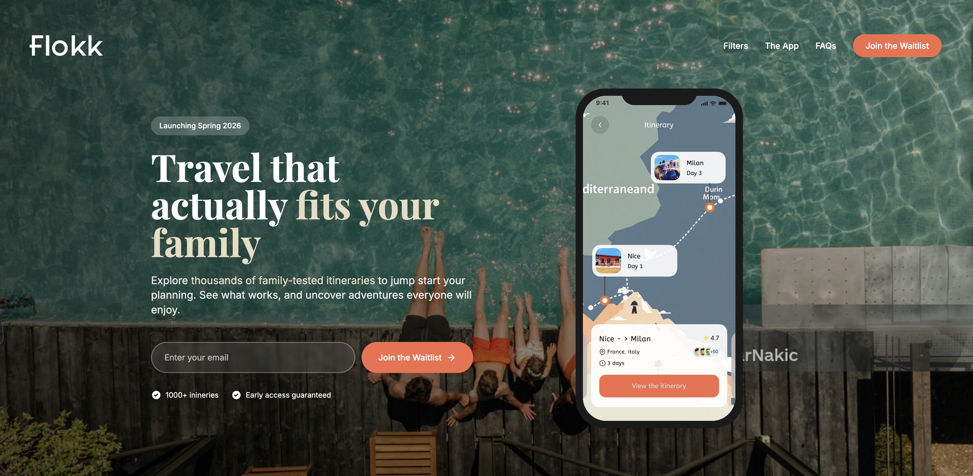
Flokk Travel
Case study
Client
Flokk Travel
Services
Product Strategy
User Research
UX Design
Go-to-Market Testing
Messaging
Industries
Travel Tech
Family Travel
SaaS
Date
January 2025
Overview
Flokk Travel is a concept for a family-first travel planning app designed to solve a common but overlooked problem: Planning trips with kids is time-consuming, uncertain, and emotionally risky.
While inspiration is everywhere (Instagram, blogs, AI), turning that into a realistic, executable itinerary for a family is still hard.
Flokk flips this by offering:
• Family-tested itineraries
• Day-by-day, practical plans
• Transparent insights into what actually works with kids
The Problem
Through user conversations and early testing, three key challenges emerged:
- Planning friction is high: Parents juggle multiple tabs, conflicting advice, and unrealistic schedules. Result: hours of effort with low confidence
- Existing solutions don't fit families: AI tools generate generic plans, travel blogs optimise for clicks not usability, and Google Maps lacks structure and context. Result: plans that look good but fail in real life
- Emotional risk is underestimated: Family trips carry pressure from limited time, high cost, and kids' needs and unpredictability. Result: "If this goes wrong, the whole trip suffers."
The Insight
Families don't want more options — they want confidence.
The real value isn't information. It's:
• Knowing a plan works
• Trusting the pacing
• Reducing second-guessing
The Hypothesis
If we provide real, family-tested itineraries that show:
- What to do
- When to do it
- Why it works
Then users will:
• Trust the product more than AI or blogs
• Be willing to pay for reduced planning effort
• Use it for key trips (1–2 times per year)
Approach
We built a lightweight landing page to test:
• Value proposition clarity
• Demand for curated itineraries
• Willingness to join a waitlist
1. Prototype a Landing Page
3. What We Learned User feedback revealed a critical gap: People liked the idea — but didn't understand what they were actually getting.
2. Initial Positioning
Early messaging focused on:
• "Family-tested itineraries"
• "Travel planning made easier"
Key Learnings
- The value was too abstract: Users couldn't distinguish Flokk from travel blogs, AI tools, or Pinterest-style inspiration
- The product wasn't visible: We described itineraries, but didn't show their depth or quality
- Trust wasn't proven: "Family-tested" was compelling — but needed evidence, not just a claim
Iteration: Making the Value Tangible
We shifted the strategy from telling → showing
1. Bring the itinerary to life
- Introduced a real itinerary preview
- Showed day-by-day structure
- Highlighted practical details (timing, pacing, food, breaks)
2. Reframe the value proposition
From: "Family-tested itineraries"
To: "A plan you can actually follow — built from real family trips"
3. Emphasise "thinking", not just content
We added:
• "Why this worked"
• "What we'd skip next time"
• "Tips for different age groups"
This positioned Flokk as: Human insight > AI output
4. Clarify the competitive edge
We explicitly contrasted:
| AI Plans | Travel Blogs | Flokk |
|---|---|---|
| Fast but generic | Inspiring but fragmented | Practical and proven |
| Unrealistic pacing | Hard to follow | Designed for families |
| No accountability | Content-first | Outcome-first |
Design Principles
To create a distinct "Flokk feel", we focused on:
- Make it feel premium but usable: Clean, calm layouts, structured day-by-day cards, editorial-style presentation
- Show the work: Real decisions, trade-offs, honest notes
- Reduce cognitive load: Clear hierarchy, visual cues (icons, sections), scannable but detailed
Testing Strategy
We designed a second iteration test:
Variant A (Control)
- Concept-led messaging
- No real itinerary shown
Variant B (New) • Real itinerary preview • "What's inside" breakdown • Stronger, concrete copy
Success Metrics
Quantitative
- Waitlist conversion rate
- Clicks on itinerary preview
- Scroll depth
Qualitative • "What do you think Flokk does?" responses
Outcome (Early Signals)
Early feedback suggests:
- Higher clarity when itineraries are shown
- Stronger trust vs AI-generated tools
- Clear resonance with "family-tested" positioning
Next Steps
- Develop a freemium model (free preview → paid full access)
- Expand itinerary library
- Introduce filters (age, pace, interests)
- Test conversion at point of trip planning
Reflection
This project reinforced a key product lesson:
"If users can't see the value, they won't believe it exists."
By shifting from concept → concrete, Flokk moved closer to becoming:
• A trusted planning tool
• Not just another travel idea platform
My Role
- Product strategy & positioning
- User research & insight synthesis
- UX and landing page direction
- Messaging & go-to-market testing
- Experiment design